Floatin' my boat with CSS animation:
Troubleshooting stutter caused by animating layout properties
December 21, 2017 (Updated Jan 8, 2018)
I've been building a simple CSS animation of a boat traveling across the viewport, puffing smoke as it goes. This article is a write-up for others who are building CSS animations and might benefit from a few of the things I learned on this project, namely:
- why you shouldn't animate properties that affect layout
- how to layer multiple animations
None of these are new discoveries. I just want to add to the examples out there that we all use to help each other learn.
If you were hoping for a good beginner's tutorial, I highly recommend Kirupa's free tutorials. These are clear, to-the-point, and come in both article and video formats.
The Basic Boat
First, I drew a little boat in Sketch and exported it as an svg. From the Sketch svg, I copied out the lines that were clearly useful and discarded the additional info.

The animation comes in three parts:
- the boat moving side-to-side
- the boat rocking up and down
- the engine smoke puffing up and away behind the boat
Transitions vs Animations
It's always worth asking yourself if you should be using a transition or an animation. In my case, I want this animation to run continuously so I need to use the animation property. For more discussion about animation vs transition, see the cssanimation.rocks article on the topic.
Moving Side-to-side
First, I made the boat move side-to-side. This animation is created by changing the margin-left property. I borrowed this idea from somewhere else but the source escapes me. We'll talk later about why animating margin-left isn't a great idea.
The animation loop consists of moving across the screen, flipping the boat when it reaches the end of the page using the transform: rotateY() property, and moving back across the screen.
Rocking up and down
The rocking motion is an animation of the transform: rotate property. This is the 2D rotate property.
I didn't want the edges of the bottom of the boat to come out of the water because it would ruin the illusion that this is a boat sitting in water. For this effect, I positioned the boat lower and used the boat's parent div as a clipping path using an inset rectangle (CSS-Tricks article on clipping paths).
With a clipping path:
I ended up adding the rocking motion to the same animation that moves the boat side-to-side. I would like a way to combine multiple animations but I couldn't because both animations used the same property, transform.
In the side-to-side animation, I have transform: rotateY() and in the rocking, I have transform: rotate(). Even though rotate and rotateY are different, they still define the transform. If I created two separate animations and applied them to the same element, the CSS would use the transform instructions from the latter animation. The highest rule of CSS: there can be only one [of each property declaration]!
Engine smoke
The smoke was a bit trickier than the other two movements. To begin with, the smoke needs to move with the boat. That's easy, just apply the same side-to-side animation as the boat. Since the boat animation merges side-to-side and rocking motions, I had to create a new animation just for the side-to-side and apply this to the smoke.
The smoke is made up of a container svg, which takes the side-to-side animation, and small svg circles as children.
<svg class="smoke" width="100px" height="40px" viewBox"0 0 153 40">
   <circle class="one" fill="gray" cx="47" cy="35" r="4"></circle>
   <circle class="two" fill="gray" cx="47" cy="35" r="4"></circle>
</svg>
Here's the boat with smoke:
Next, I needed to make the smoke puff. I experimented with the movement and opacity in an animation on the first circle.
This just took a bit of troubleshooting. Let me know if you have a tool for generating the frames of an animation. That would make this process a little easier than watching the animation over and over.
I originally had three circles but when I started applying the same puffing animation to each circle and staggering them with a delay, I realized I might not need all three. Two seemed to do the trick.
Looks pretty good, eh? You've probably noticed by now that when the boat flips and the smoke flips, a puff of smoke makes an incredible jump in space that indicates some very improbable fluid dynamics.
I spent a bit of time drawing little timelines to visualize how I could make the puffing animation a factor of the boat's animation so that the puffs would dissipate conveniently before the boat flips.
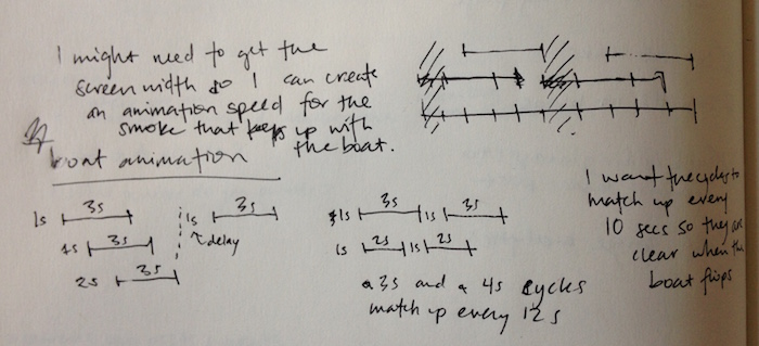
This syncing is something I still haven't resolved. I've got bigger fish to fry.
Why you shouldn't animate layout changes
My partner, Kevin, noticed that the animation wasn't quite smooth.
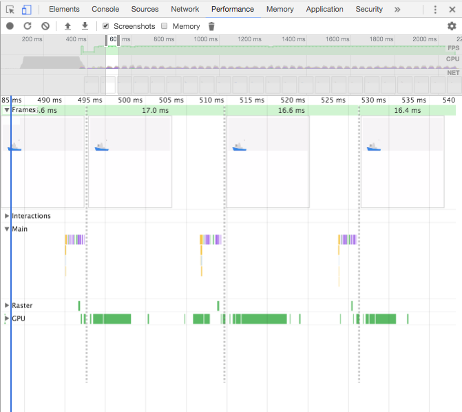
We recorded the animation using Chrome Dev Tools and found that nothing was slowing the animation down.
How did we figure this out?
The browser carries out any instructions one at a time. We're computing on a single thread here. To animate a change, the browser has to calculate all those fancy in-between frames for us and render them.
If carrying out computing instructions takes too long, the render doesn't happen regularly and results in a visible lag. If the lag is great enough, the browser is smart enough that it can skip a frame to try and catch up. You might see an even larger visible jump in your animation.
If you zoom in, Chrome Dev Tools shows you how long each of these instructions takes. It's really incredible how much detail is in the performance readout. You can zoom in and out of huge amounts of data quickly and easily. This tool is really one of the best interactive data visualizations I've ever seen.
In my case, you could see that the frames were still being rendered at the expected frame rate.
At this point, my partner asked me how I was animating the boat. When I mentioned the margin-left, he explained two valuable lessons he has learned:
- The browser rounds pixels, sometimes resulting in imprecise graphics.
- Every time you change a layout property, the browser recalculates the entire layout, even if nothing but the element in question was affected.
He suggested a quick test, push the browser width to extremes to see if the problem gets worse.
Making the browser width very small had a telling result:
The duration of this animation is 10 seconds so the boat has to move the width of the viewport in 10 seconds. The browser has to divide up the width of the viewport into 10 seconds x 60 frames per second = 600 frames. When the browser divides the width of the viewport by 600, there is bound to be some rounding because it's unlikely that the viewport width is a multiple of 600.
Ok, so we have some pixel rounding. If my viewport is 601 pixels wide, my little boat will have to jump one extra pixel at some point.
If my viewport is less than 600 pixels wide, then my boat will have to pause a lot because multiple frames will round to the same pixel position.
I replaced all of my margin-lefts with transform: translate and the result is much smoother.
Wrapping Up
This is where I'm stopping. I tried to make two more changes but got stuck.
-
I still haven't fixed the smoke puffs that flip when the boat reaches the end of the screen. I admit I'm stumped.
-
I want the boat to cross the screen at the same speed, regardless of viewport width.
On this second point, I tried using calc to try and turn a vw length value (px) into a time value (seconds). I couldn't find a way to make it work.
The other option is to use Javascript, something I've been avoiding with this whole project. It appeals to me to be able to use CSS as much as possible.
Returning to my goals, when I put this on my website, I will probably have the boat go off the edges of the page instead of turning around so that will solve problem #1.
Props to Glitch.me
I began this animation using a cool live development tool called Glitch.me. It was a great way to get started quickly because Glitch creates the basic files for you to jump in and start editing. I didn't have to worry about setting up my project files and creating a git repo. Also, Glitch has a cute interface that is wonderfully different than everything else out there.
I eventually moved the code into a local git repo and finished building it there. I wanted to document the process of creating this animation. My favorite way to do this is by making commits in a git repo so I can roll back the code and snapshot significant steps.
I'll update here when I've added the animation to my site. Thanks for reading!
Update
I've added the animation to my site. To create a roughly similar boat speed on different size screens, I've used media queries.
I discovered that Chrome made an update recently that undoes my clip-path on the boat. I was totally stumped so Kevin was super helpful again. He is quick about coming up with hypotheses for what might be wrong AND simple tests to check if the hypothesis is on the right track. He turned off the boat's animation and found that the clip-path worked again. So animation is part of the problem. He also tried tinkering with the z-index of the boat and that showed us that by changing the z-index, we could undo the clipping on the still boat. Kevin said there might be a bug in Chrome that is causing the animation to composite funny. Perhaps someone who enjoys digging into bugs like this can provide an explanation. :)